


It seems crazy to have such a heated debate on facts that are so easily measurable. Here we use the SCF from 1992 to 2010 to show the pretty unambiguous rise in wealth inequality in the United States. The housing boom hid the rise in inequality to some degree, but the crash in house prices from 2007 to 2010 made inequality transparent.
At the end of this post we tell you where to get the data and we give you the Stata code. We did this pretty quickly, so happy to be told if we’ve made some mistake.
The SCF is not a huge sample, so we have chosen to look at the top 20% (80% to 100%) of the wealth distribution versus the middle 20% (40% to 60%) of the distribution every year. Below, we plot the ratio of wealth of the richest 20% versus the middle 20%. We took the averages within each of these quintiles.

The graph shows that the top 20% of the wealth distribution had 15x the wealth of the middle 20% of the distribution in 1992. In 2010, the richest 20% has more than 25x the wealth of the middle 20%. How is that not a substantial increase in wealth inequality?
The pattern is especially stark if we exclude home equity. This is a useful exercise because we know from 2010 to 2013 financial assets have performed very well. Housing has performed decently as well, but much of the strong performance of housing is driven by investors who have been able to build good credit are likely part of the richest 20% of the distribution. We don’t yet have the 2013 SCF available.
To be clear, the split of households into quintiles is still based on total net worth. The graph below plots the ratio of non-home equity wealth of the richest 20% to the middle 20%:
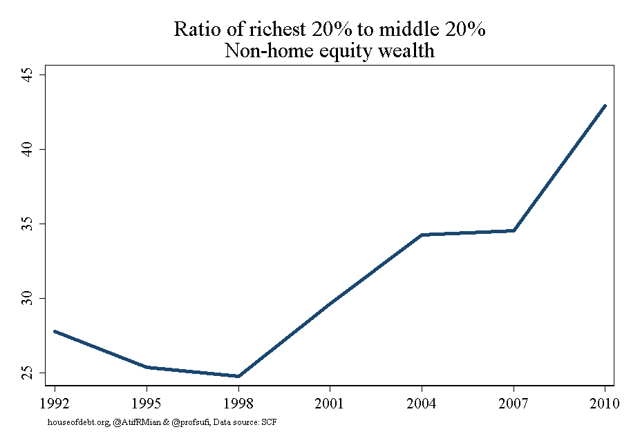
That looks like a pretty sharp rise in wealth inequality to us. In 1998 the richest 20% had 25x the non-home equity wealth of the middle 20%. it has risen to almost 45x in 2010.
Just to complete the story, here is inequality using home equity wealth:

The rise in wealth inequality focusing only on home equity is smaller in magnitude, but goes in the same direction overall. Interestingly, the middle 20% made gains on the top 20% from 2004 to 2007, which reflects the fact that house prices rose fastest in middle and lower income areas, something we have documented in our research.
We are happy to be corrected here. Like we said earlier, we did this quite fast. The data sets are available from the Fed. They are the Stata data sets based on the SCF bulletins. For example, here is the link to the 2010 data. And here is our Stata code — let us know if there is a mistake:
**5/24/2014: Piketty and SCF
foreach num of numlist 1992 1995 1998 2001 2004 2007 2010{
cd $scf
use rscfp`num’, clear
sort YY1
by YY1: keep if _n==1
xtile t1=networth [aw=wgt], nq(5)
foreach x of numlist 1/5{
gen networth`x’=networth if t1==`x’
gen networthhom`x’=homeeq if t1==`x’
gen networthnhm`x’=(networth-homeeq) if t1==`x’
}
collapse (mean) networth? networthhom? networthnhm? [aw=wgt]
gen year=`num’
cd $datapath
save t`num’, replace
clear
}
foreach num of numlist 1992 1995 1998 2001 2004 2007 2010{
append using t`num’
erase t`num’.dta
}
foreach y in networth networthhom networthnhm{
gen `y’rat=`y’5/`y’3
}
*graphs
# delimit ;
graph twoway line networthrat year,
scheme(s1mono) title(“Ratio of richest 20% to middle 20%” “Total wealth”)
xtitle(“”) ytitle(“”) lc(maroon) lw(thick)
xlabel(1992 1995 1998 2001 2004 2007 2010) lw(thick)
caption(
“houseofdebt.org, @AtifRMian & @profsufi, Data source: SCF”,
size(vsmall)
) xsize(4.25) ysize(3);
# delimit cr
graph export “$output\houseofdebt_20140524_1.png”, replace
# delimit ;
graph twoway line networthnhmrat year,
scheme(s1mono) title(“Ratio of richest 20% to middle 20%” “Non-home equity wealth”)
xtitle(“”) ytitle(“”) lc(navy) lw(thick)
xlabel(1992 1995 1998 2001 2004 2007 2010) lw(thick)
caption(
“houseofdebt.org, @AtifRMian & @profsufi, Data source: SCF”,
size(vsmall)
) xsize(4.25) ysize(3);
# delimit cr
graph export “$output\houseofdebt_20140524_2.png”, replace
# delimit ;
graph twoway line networthhomrat year,
scheme(s1mono) title(“Ratio of richest 20% to middle 20%” “Home equity wealth”)
xtitle(“”) ytitle(“”) lc(dkgreen) lw(thick)
xlabel(1992 1995 1998 2001 2004 2007 2010) lw(thick)
caption(
“houseofdebt.org, @AtifRMian & @profsufi, Data source: SCF”,
size(vsmall)
) xsize(4.25) ysize(3);
# delimit cr
graph export “$output\houseofdebt_20140524_3.png”, replace

Aidan has been writing about personal finance for over 6 years. Prior to this, he worked as a Corporate Finance Analyst where he specialized in Due Diligence, Company Valuations and more. He is a CFA charterholder.


