


Economists of all stripes are baffled by continued economic weakness in the United States. The easiest way to see the weakness is to compare where we are in terms of GDP today relative to historical trend growth, something we did in a previous post. It is clear that one of the main drivers of this weakness is the tepid recovery in consumer spending since the Great Recession. We made note of this fact in another previous post, but we are certainly not alone in noticing this fact.
Our book, House of Debt, makes an evidence-based case for what caused the severe Great Recession and what explains the continued economic weakness. The debt-fueled housing boom artificially boosted household spending from 2000 to 2006, and then the collapse in house prices forced a sharp pull-back because indebted households bore the brunt of the shock. As households were left reeling with the challenges of getting out of debt, the lack of policies targeting this problem exacerbated the effects of the housing crash on consumer spending.
The BEA released state-level personal consumption expenditure data today, and it strongly supports our view. In the charts below, we take the 20% U.S. states that had the largest decline in housing net worth from 2006 to 2009, and we compare them to the 20% states U.S. states that had the smallest decline over the same time period. The states with the largest decline are: Arizona, California, Florida, Michigan, and Nevada. The states with the smallest decline are: Arkansas, Iowa, Kentucky, Louisiana, Nebraska, North Carolina, North Dakota, Oklahoma, Pennsylvania, South Dakota, and Wyoming. We make sure each group contains 20% of the population, which is why there are more states in the smallest decline category.
Here is total consumption, indexed to 2006, for the biggest decline and smallest decline states:

The pattern is striking. The collapse in total consumption was much larger in states that were hit hardest by the decline in house prices, something we show in our book. It wasn’t just the fact that house prices collapsed. It was also because these states had the highest debt levels when house prices crashed. It was the combination of the two that decimated household spending in these states. Even in 2012, there continues to be a very large difference in the level of consumption. The very large gap between the blue and red lines shows how long-lasting the effects of the housing crash have been.
Total consumption can be broken down into three categories: durable consumption, non-durable consumption, and services. Here are the graphs of all three:


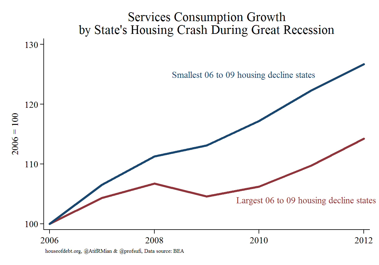
Across all three categories of consumption, there is a large gap between hard hit states and states that largely avoided the housing collapse. And that gap has persisted all the way through 2012. The gap is smallest for non-durable goods like groceries and clothing. This makes sense because these are necessities–even people who have seen their wealth decimated need to eat. The gap is largest for durable goods, which also makes sense given that the housing market directly fuels purchases of durable goods such as furniture, electronics, and home appliances. The services gap is quite large as well, which is a bit surprising to us. Further, the gap between consumption of services appears to be getting larger even through 2012.
Many have argued that we overstate the importance of housing and household debt in explaining the Great Recession and weak recovery. They point to the banking crisis, policy uncertainty, or excessive regulation as equally or even more important. The data released today by the BEA show pretty clearly that the arguments we make in House of Debt remain relevant for thinking about economic weakness today. In our view, the explanation we provide is the most consistent with the striking difference in consumption across states.

Aidan has been writing about personal finance for over 6 years. Prior to this, he worked as a Corporate Finance Analyst where he specialized in Due Diligence, Company Valuations and more. He is a CFA charterholder.